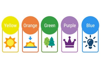
28 Aug Selecting the Right Colour for School Furniture
How colour affects learning and mood.
The relationship between colour and mood has long been acknowledged, although you may not have considered it before. However, colour is an influential tool when used to your advantage in a classroom.
When designing school furniture, it is important to recognise the colours that encourage learning and creativity. Klick Technology has compiled a list of the most impactful colours to use in school furniture refurbishments and we can offer specialist advice on colour selection.
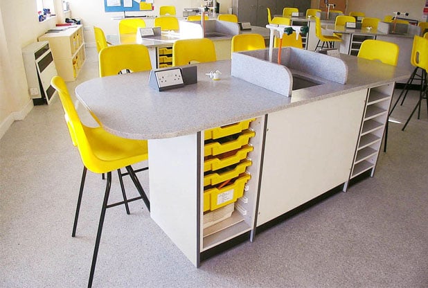
Yellow evokes a sense of happiness from within and it is easy to see why when you think of sunshine. This gives the colour the ability to enhance a classroom. As seen at Robert Bloomfield Middle School, yellow adds brightness to the room.
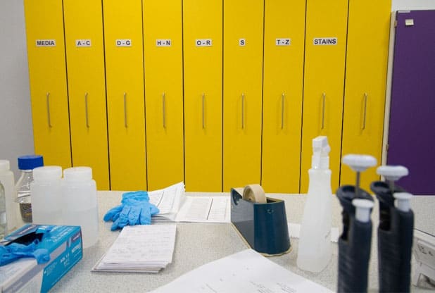
Yellow is a versatile colour and can be used to draw attention to an important area. York University chose to use this to their advantage by selecting yellow for their pull out storage units that are used to store chemicals.
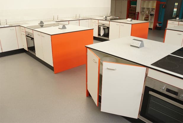
Orange is a mood-boosting colour and is reminiscent of a beautiful sunset. The Lakes school food tech room features orange end panels and contrast edging, to add impact and inspire students. Looking deeper into the physical effects of the colour, some theorists believe a room full of orange actually increases the supply of oxygen to the brain (Gutierrez, 2018).
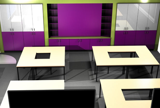
Green and purple are a powerful combination and they can be seen working together at the Penrice Community College, creating a space that is truly one of a kind. Green improves efficiency and evokes a feeling of restfulness and calm according to Dr. Kate Lee (Lee, 2018). This is extremely important in the classroom to promote focus. Purple on the other hand is known as the colour of royalty. If you want to bring an element of sophistication to the classroom this is the way to go. This colour also encourages creativity and imaginative thinking.
Feeling blue? This may not mean what you think it does. ‘Feeling blue’ can actually mean feeling productive as blue stimulates a high level of thought (Newport, 2018). This colour can be seen in action at Barrow Hill Primary School.
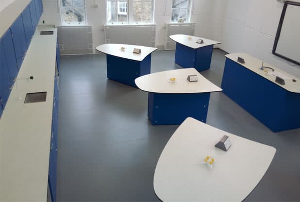
Blue is best offset with a warmer colour; a great way to do this is to use a contrast wall as seen at Rendcomb College.
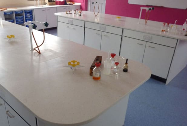
Colour and mood are intertwined and can be used to your advantage as we have demonstrated with some of the colours used in our previous projects.
Make sure to subscribe to our newsletter. This will assist you in making a more informed decision about your refurbishment needs.
Email us at sales@klicktechnology.co.uk or give us a call on 0161 998 9826 to have a chat about your project.
Let’s live a little more colourfully!
Lauren
